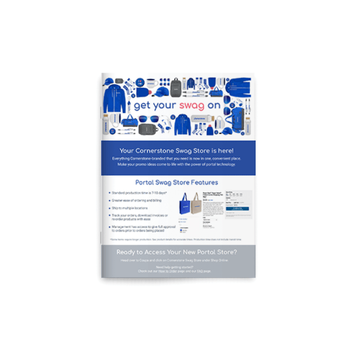
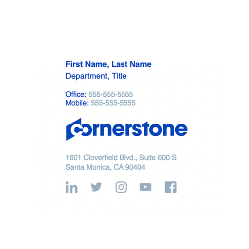
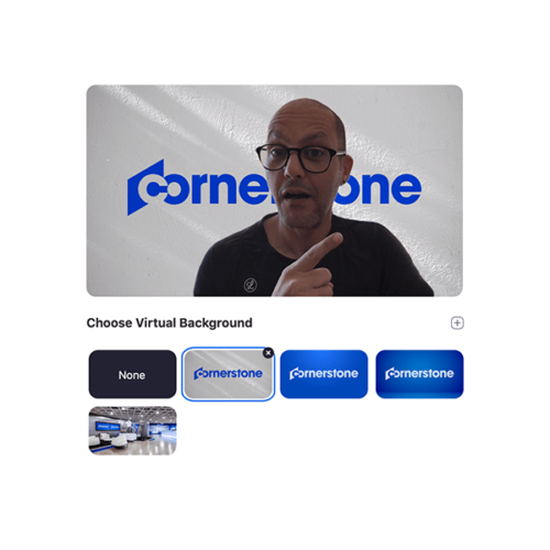
Check out our most recent additions to the Brand Corner — download the new product logos and an updated Cornerstone Cares email signature.
Brand Corner
Consistency is essential for a global brand like Cornerstone. This guide is the foundation for you to build from when writing, designing, or making anything for us. But it only works if you use it. So start here to always create amazing (and on-brand) content.
Brand Corner Jingle – C-S-O-D brand dot com/Use it for work or to impress your mom/C-S-O-D brand dot com/Find it on the net, and not a CD rom/C-S-O-D brand dot com/Like they said in the ‘90s, it’s da bomb/C-S-O-D brand dot com/Answers your questions and even your qualms/C-S-O-D brand dot com/Sing once more with some added aplomb/C-S-O-D brand dot com
Framework
These are the building blocks of Cornerstone. In one form or another, everything we make is an expression of them.
Purpose
Cornerstone is the people development company.
We believe people can achieve anything when they have the right development and opportunities. Cornerstone gives leaders and their teams the tools and training needed to unlock people’s full potential. Our technology, content, expertise, and specialized focus make that happen.
Attributes
Specialized
We are singularly focused on developing people through our tenured, dedicated experience.
Authentic
We are honest, transparent, human, and relationship-focused with no pretenses.
Empathetic
We are on this journey together, walking side by side with our clients.
Visionary
We are pioneering leaders and ever-curious explorers driving the future of work.
Personality
Cornerstone looks at the world and strives to change it for the better. We aspire to create the pleasantly unexpected. We don’t believe in magic. It just looks like we do.
Tagline

Like our name, our tagline is constant. Marketing campaign copy, on the other hand, changes periodically. That's why marketing phrases always come before our name and tagline. Never after.
Campaign — Logo — Tagline
Always Learning — Cornerstone — realize your potential
Blueprint
The layout of our brand. Consider each element when creating something for Cornerstone.
Design
Like an alchemist, our design blends art and science. We channel pure imagination into fluid, functional form. All to comprehensively service the particular needs of people.
Visual identity
Three pillars define our visual identity — color, logo, and angle. They work together to represent and develop our strengths as a brand.
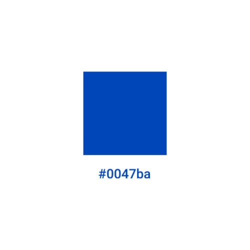
Blue has always been at our core. "Electric Blue" is just our latest, most vibrant update.
Our logo is our name and represents us — bold yet foundational.

At 30 degrees, you'll find this upward angle — a symbol of forward progress — everywhere in our brand.
Logo
From the bold typeface and elegant geometry to the implied forward momentum and hidden infinity symbol, you'll find thoughtful intention in our logo's form and design.

Brandmark
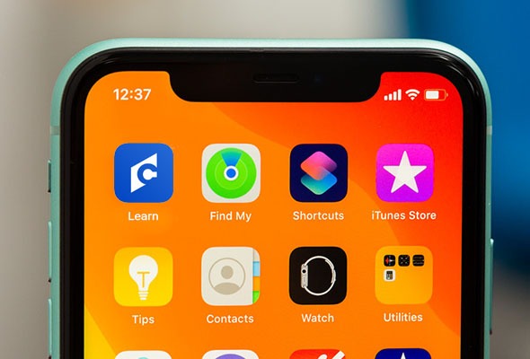
Use this short version of our logo for social media. If you look closely, you can see the square leaping to the peak of its geometric potential.

Solutions
We have a lot of solutions, and each one has its own logo. These are what they look like.
In the wild
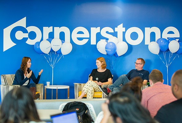
The logo and brandmark spotted in their natural habitat. See how they attract the eye while still blending into their surroundings.
Layouts
Our simple composition tool, the Cornersquare, is square-framed and remarkably easy to use, allowing flexible consistency.

Using the Cornersquare
Shift the square frame around to easily organize and layout your photography, illustrations, and text boxes.

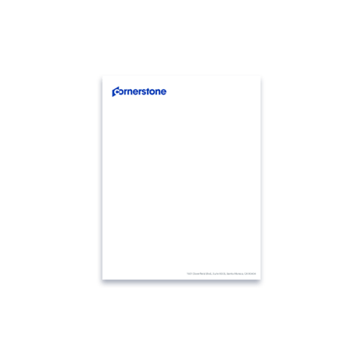
Letter

Letter

Letter

Letter

HD screen

HD screen

HD screen

HD screen

Tabloid

Tabloid

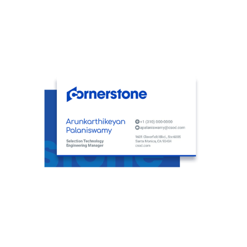
Business card

Email signature
Fonts
Our typefaces are the visual representation of our voice. That's why they're welcoming as well as geometric. Plus of course, easy-to-read.
Comfortaa
Use this fresh and friendly typeface for headlines and buttons. Headlines are compact, captivating intro statements. Buttons are short, first-person calls-to-action that complete the sentence, "I want to..."
Bold
Aa Bb Cc Dd Ee Ff Gg Hh Ii Jj Kk Ll Mm Nn Oo Pp Qq Rr Ss Tt Uu Vv Ww Xx Yy Ww Xx Yy Zz
Regular
Aa Bb Cc Dd Ee Ff Gg Hh Ii Jj Kk Ll Mm Nn Oo Pp Qq Rr Ss Tt Uu Vv Ww Xx Yy Ww Xx Yy Zz
Roboto
Use this simple and clear typeface for subheadlines and body copy. Subheadlines are one to two concise sentences that emphasize and describe headlines. Body copy are text blocks that give details to headlines and subheadlines.
Bold
Aa Bb Cc Dd Ee Ff Gg Hh Ii Jj Kk Ll Mm Nn Oo Pp Qq Rr Ss Tt Uu Vv Ww Xx Yy Ww Xx Yy Zz
Regular
Aa Bb Cc Dd Ee Ff Gg Hh Ii Jj Kk Ll Mm Nn Oo Pp Qq Rr Ss Tt Uu Vv Ww Xx Yy Ww Xx Yy Zz
Light
Aa Bb Cc Dd Ee Ff Gg Hh Ii Jj Kk Ll Mm Nn Oo Pp Qq Rr Ss Tt Uu Vv Ww Xx Yy Ww Xx Yy Zz
Century Gothic
Use this easily available typeface when utilizing all Microsoft® products and anywhere else you don't have access to Comfortaa or Roboto.
Bold
Aa Bb Cc Dd Ee Ff Gg Hh Ii Jj Kk Ll Mm Nn Oo Pp Qq Rr Ss Tt Uu Vv Ww Xx Yy Ww Xx Yy Zz
Regular
Aa Bb Cc Dd Ee Ff Gg Hh Ii Jj Kk Ll Mm Nn Oo Pp Qq Rr Ss Tt Uu Vv Ww Xx Yy Ww Xx Yy Zz
Icons
Each icon is designed to share the same geometry and sense of humanity as our primary typeface, Comfortaa.


Colors
Constraining ourselves to a simple color palette of blue and white gives everyone the opportunity to easily create and identify on-brand content.
Primary
Use these colors as the main elements for everything you make.
Electric blue

2728C
93 / 78 / 0 / 0
#0047BA
Great white

N/A
0 / 0 / 0 / 0
#FFFFFF
Secondary
These are our accent colors. Use them sparingly and never as the main attraction. The grays are also for text.
Marigold

1235C
0 / 35 / 80 / 0
#FDB14A
Mint

3248C
53 / 0 / 42 / 0
#6FD6AF
Seafoam

298C
65 / 10 / 2 / 0
#3CB4E5
Coral

709C
0 / 77 / 37 / 0
#F26178
Dark grey

432C
79 / 64 / 52 / 44
#323E48
Grey

7545C
78 / 61 / 44 / 25
#415364
Light grey

7544C
58 / 41 / 34 / 4
#758592
Illustration
Centered around people, our hand-made illustration style represents complex or abstract concepts in simple, approachable, and fun ways.
Flow of work

Leadership

Always learning

Skills

Writing
Writing is hard. Our writing is easy. Easy to read and easy to understand. We present ideas in simple yet interesting and uncommon ways, while still connecting them with people's emotions and intelligence.
Voice
Our voice is simply our attributes — specialized, authentic, empathetic, visionary — in action. Consistently put each of those into your writing, and you'll do great.
Voice checklist
Our attributes and copy philosophy are baked into these four questions. Keep them in mind when writing anything that represents Cornerstone.
01
Is it specific?
Write focused on one thing at a time. No headline, sentence, or paragraph can or should do everything. Then check that each sentence accomplishes one goal and each word adds value.
02
Is it genuine?
Write how people speak. Don't get lost in the hot, new business jargon of the week. Then check if you could say it in fewer words, if it sounds personable, and if a seventh-grader could understand it.
03
Is it clear?
Write about the benefits to the reader first. They're the important ones here. Then check the spelling, grammar, and formatting, check the logic and flow, and check that the reader is the main character.
04
Is it interesting?
Write to separate us from our competitors. Let them write like where we've been. We'll write like where we're going. Then check your tone and if it could sound less common and more compelling.
Tone
Tone is the sound of our voice. While our voice is a constant, a metronome, our tone oscillates from quiet to loud depending on the situation.
Quiet
White papers

Press releases
Solutions

Explainers
Marketing

Websites
Social media

External videos
Events

Ads
Loud
Quiet
A quiet piece is efficient, useful, and modest. No need to overcomplicate things or be clever. Keep it simple and direct. Quiet is for when being clearly understood is the only thing that matters.
Loud
On the other hand, a piece of loud content draws attention to itself. It’s pithy, distinct, funny even. The goal here is to be heard and felt above everything else.
Quiet vs. loud
But loud doesn’t mean you’re ALL CAPS screaming at people. In the same way that quiet doesn't mean you're passive or soft-spoken. They're both just levels of our voice and personality. Quiet is a low, background hum. Loud is a fully immersed Cornerstone experience. If loud is our voice cranked up to a 5 while quiet is us turned down to a 1, our average tone is about 3.3.
10 writing rules
We've all heard the saying, "Rules are meant to be broken." But when it comes to these rules, please don't.
01
99 percent (not 99%) of the time we follow AP style.
02
No matter what you call it, always use the Oxford, serial, or Harvard comma. It’s the last comma in a list before the conjunction.
03
Add spaces before and after en dashes (–) and em dashes (—) but not hyphens.
04
Headlines are sentence case but don’t end in periods unless they’re more than one sentence. Subheadlines are also sentence case but do end in periods. And CTA buttons are all lowercase, no periods.
05
You only get one exclamation point a day. Use it wisely.
06
Our industry is a spoon full of alphabet soup — HCM, HRM, HXM, and those all mean the same thing. So avoid using acronyms or initialisms wherever possible.
07
Try not to use more than three commas in a sentence. If your sentence has more, write a better sentence. Or write two.
08
Cornerstone OnDemand vs. Cornerstone vs. CSOD – Our full name is Cornerstone OnDemand. But we go by Cornerstone. The only time you’ll need to use our full name is the first time you mention us in long-form documents like press releases and legal. Every other time, just call us Cornerstone. And for our initials, only use CSOD when you’re referring to our stock, a webpage, or one of our email addresses.
09
Cornerstars – Anyone who uses Cornerstone or works here is a Cornerstar. Most likely, if you’re reading this, you’re a Cornerstar. Congrats.
10
Our first language is American English, but we’re a global brand. If something you're writing is getting translated or localized, try to avoid using double negatives, slang, and idioms. Those don't translate well.
Media
Our approach to media embodies personal journeys. We focus simply on the travelers — the people at work — reflecting their lives, capturing their moments of growth, and highlighting their successes.
Principles of motion
Motion guides you on your journey. It carves paths and connects concepts. It provides details and clarifies instructions. And most of all, it grabs attention and delights.
Educate

Motion is eye-catching, so use it to create a hierarchy, highlighting the most important information and actions.
Emphasize

Motion is balance, so use it to enhance your point, making sure to not create unnecessary distractions.
Enliven

Motion is exciting, so use it to add some fun and enthusiasm to places people might not expect.
Photos
One photograph can tell a complex, thousand-word story. Our photos enhance stories without muddling the message and refine them without losing the heart.
Portraits

Solid backdrops, with slight vignettes. Focus on the subject. Don't crop features, like heads and arms.
Events

Reflect the audience (fun and engaged), presenter (alone on stage), and scale (wide angle for context).
Screen interactions
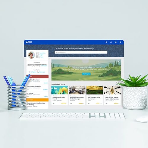
Present without devices. Pair screens with real-world elements to showcase our offerings.
Websites

Take in-house. Utilize internal talent. Focus on the subject, with few extraneous elements.
Fullscreen solutions
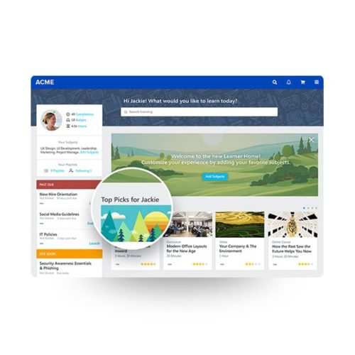
High-resolution only. Contain within an abstract browser against a solid, color-branded background.
Videos
How to capture the brand in motion. Cinematography, assets, bumpers, lower thirds, and other video elements. But right now, all we have is this trailer for the feature that's coming soon.
Experience
How people experience the brand matters. How it feels, sounds, and even smells. Just like our events fill open spaces, guidelines will soon fill this one.
Resources
Take the brand with you. Download logos, fonts, guides, and templates. Plus order swag! Even more, coming soon.


